Look Here, Something To Criticise!!
| Good [+1]Toggle ReplyLink» puresexmegs replied on Tue Feb 12, 2008 @ 6:59pm |
 Coolness: 48840 Coolness: 48840 | or maybe the name was to get some hot chicks in some hot outfits to do some funky dance moves to some great music in a great atmosphere?
If you went to the promoters house they would rpove to you with msuic that funk can exist in psytrance. I heard it myself when I asked about the name. |
| I'm feeling videogame junkie right now.. | |
| Good [+1]Toggle ReplyLink» flo replied on Tue Feb 12, 2008 @ 6:59pm |
 Coolness: 146435 Coolness: 146435 | i like the flyer but i think it would be much nicer with an other font than the curly one, especially on the front side... the background is nice but the title kinda kills it, imo.
nice "no whistles" and "no tams" logos :) you should add another one forbiding gloochtikss |
| I'm feeling phd powa !!! right now.. | |
| Good [+1]Toggle ReplyLink» Screwhead replied on Tue Feb 12, 2008 @ 7:04pm |
 Coolness: 685700 Coolness: 685700 | I'd really like to hear the psytrance that has enough elements of funk or even jazz to warrant calling psytrance funky. |
| I'm feeling fuckin' crazy right now.. | |
| Good [+1]Toggle ReplyLink» flo replied on Tue Feb 12, 2008 @ 7:09pm |
| Coolness: 146435 | guys i think you might be getting paranoiac about what means "funk" on the flyer... i guess this is more like a pun, and that the event features rather psy-something music, with a funky-ish chillroom but that's all... |
| I'm feeling phd powa !!! right now.. | |
| Good [+1]Toggle ReplyLink» Mico replied on Tue Feb 12, 2008 @ 7:12pm |
 Coolness: 150570 Coolness: 150570 | Seriously. It's just a play on words. |
| I'm feeling cool right now.. | |
| Good [+1]Toggle ReplyLink» greatjob replied on Tue Feb 12, 2008 @ 7:16pm |
 Coolness: 282565 Coolness: 282565 | Originally Posted By FLO
guys i think you might be getting paranoiac about what means "funk" on the flyer... i guess this is more like a pun, and that the event features rather psy-something music, with a funky-ish chillroom but that's all... Read the title of the thread! lol |
| Good [+1]Toggle ReplyLink» flo replied on Tue Feb 12, 2008 @ 7:19pm |
| Coolness: 146435 | yeah ok i forgot you love drama and flame wars on this board... my bad :p |
| I'm feeling phd powa !!! right now.. | |
| Good [+1]Toggle ReplyLink» greatjob replied on Tue Feb 12, 2008 @ 7:22pm |
| Coolness: 282565 | whoa whoa whoa, does it not say criticize ?
thanks. lol |
| Good [+1]Toggle ReplyLink» Choda_Bean replied on Tue Feb 12, 2008 @ 7:37pm |
 Coolness: 220080 Coolness: 220080 | i'm no fucking expert on flyer design, or music defenition,
but uhm..... what the hell is goin on here? its almost as good as "little plastic castle" why dont you call it "SUCK MY FUCK" or something? Maybe the name of this party means: girls just wanna have funk, and its a psytrance party, so no girls will be there! what the FUNK is happening to the since???? |
| I'm feeling your nuts right now.. | |
| Good [+1]Toggle ReplyLink» Strik_IX replied on Tue Feb 12, 2008 @ 7:42pm |
 Coolness: 88750 Coolness: 88750 | How can it be BYOB if it's a 16+ event? |
| I'm feeling myself right now.. | |
| Good [+1]Toggle ReplyLink» the_worm replied on Tue Feb 12, 2008 @ 7:44pm |
 Coolness: 61165 Coolness: 61165 | its almost as good as "little plastic castle"
hehehohohhihihihihhahahaha!!!Nice one. |
| I'm feeling 11:11 right now.. | |
| Good [+1]Toggle ReplyLink» Choda_Bean replied on Tue Feb 12, 2008 @ 7:48pm |
| Coolness: 220080 | little dieing goldfish |
| I'm feeling your nuts right now.. | |
| Good [+1]Toggle ReplyLink» AlienZeD replied on Tue Feb 12, 2008 @ 10:15pm |
 Coolness: 509670 Coolness: 509670 | Psytrance can be hella funky, don't believe me? Come hear for yourself! :)
[ www.rave.ca ] The chill room will be head lined by [ rave.ca ] own Sarcastic and Drixel, who have promised me REAL funk. And whoever said psytrance parties don't have hot girls, obviously doesn't go to psytrance parties... In any case, the party will speak for itself, don't miss it!! |
| I'm feeling drunk right now.. | |
| Good [+1]Toggle ReplyLink» greatjob replied on Tue Feb 12, 2008 @ 10:23pm |
| Coolness: 282565 | Oh I had a good one Little Plastic Tampon, sorry mel I had to...
GOLD, It's GOLD I'm tellin ya Jerry! |
| Good [+1]Toggle ReplyLink» rawali replied on Tue Feb 12, 2008 @ 11:26pm |
 Coolness: 140795 Coolness: 140795 | as a graphic designer...
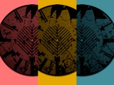
i dont give a flying fuck about your use of the word funk, i aint gonna talk about the title, thats your shit, wtv graphically speaking... front-side i think its... a weird mix between plain and psychedelic, the back-ground visual has some psychedelic coulors to it but it could be a whole lot more fucked up if you had... say given it a fish-eye look or a long-exposure look or just a bit of tilt... maybe high-contrast... maybe just a tracing with some kind of a neon glow to it... either that or say fuck off to the psychedelic color layered on top back-side, other than the fact that its the same font... it doesnt really have any continuity with the front-side, you got something pretty cool going on with the line-up box (and some elements front side for continuity)... id tottally go with a look like that to lay-down all the info... thing is, you got this tekky looking line-up box with a psychedelic pyramid thingy on the right and a gloomy looking box this that borders the whole thing (ill get back to that)... my one point of advice for the graphic part of this is choose a style and commit, once you choose a style, check stuff out... album covers, other flyers, posters, illustrations, whatever you can find basically... pick elements you like that will mix well, and mix em. kinda like djing... if you dont know what'll mix well or dont know how to mix em, take a piece of paper and do some sketches (really rough sketches, just a couple of minutes each)... this might sound boring or useless but nothing could be farther from the truth, doing sketches will help you visualise your concept and give you shitloads of ideas. typography-wise, (and by that i mean the layout of the text and not the font... ill get to that latter) front side, first of all id put the logo in the bottom right corner... the top right corner just looks way to busy and thats the eyes entry point... you wanna keep that inviting... using three different font sizes really isnt helping you prove anything here... id say, either keep it simple all the way through, or make completely fucked up all the way through... back-side... the text and the border is a really bad idea... youve got shitloads of information here and you probably dont want to cut down on the amount of text but let it breathe... like that dj... good job on the logos though, its a bitch to get different shapes and shit to all look like they are the same size, so kudos on that the font... the basic font really aint that bad if you got the visuals to go with it... (in this case id go funky and round neon-ish stuff, lots of yellow and magenta) thing is, you got this very round font with a reaaaally square, 90-degrees-all-over-the-place, sky-line right underneath... the strokes (or contours if you will) and drop shadow... its just... too much, this looks like a pizza-restaurant delivery menu (trust me... i do those 20 hours a week), when looking for a font, find one that'll be nice, as-is or with a bit of a sutle outline just so you can read it better on a hectic background my biggest advice for the layout is... for heavens sake, use a visual grid... split the thing in 4+ margins all around and clip your text in those comlumns and dont put text in the margins... dont try and do text layout in photoshop (im guessing here) especially when you have so much of it... use quark of indesign for text... if you dont know how to use either of em... get indesign (QUARK MUST FUCKING DIEEEEEEEEE!!!) and have some nasty fucking fun. Also, always print the shit out to make sure everything is legible and just flows nicely... there's a shitload of things you dont see on a screen... dont trust the colours on a little inkjet printer (or any printer for that matter) though, those things are waaaaaaay off... offset presses (err like these)  tend to be just a tiny whole frigging lot more precise... tend to be just a tiny whole frigging lot more precise...
if you have any questions or need help or programms or whatever... im on your msn Update » rawali wrote on Tue Feb 12, 2008 @ 11:31pm ...holy fucking hell... did i just write all that... |
| I'm feeling like a killer robot right now.. | |
| Good [+1]Toggle ReplyLink» nothingnopenope replied on Tue Feb 12, 2008 @ 11:33pm |
 Coolness: 201335 Coolness: 201335 | I think you should keep the name just because of the amount of pretentious defenders of funk who are getting pissed.
Many of the most popular breaks and DnB tracks sound more like electronic circus music than funk. But the name is horribly inaccurate though. Psytrance is definitely a spawn of techno. Update » nothingnopenope wrote on Tue Feb 12, 2008 @ 11:37pm love the no-bongo warning.. the people who play those at parties are 100% douches |
| I'm feeling gangsta right now.. | |
| Good [+1]Toggle ReplyLink» greatjob replied on Tue Feb 12, 2008 @ 11:37pm |
| Coolness: 282565 | Originally Posted By SCOTTYP
defenders of funk best band name ever |
| Good [+1]Toggle ReplyLink» MelooDie replied on Wed Feb 13, 2008 @ 8:34am |
 Coolness: 248535 Coolness: 248535 | i'm ze funk |
| I'm feeling drastik right now.. | |
| Good [+1]Toggle ReplyLink» Kishmay_Pinas replied on Wed Feb 13, 2008 @ 10:14am |
 Coolness: 103365 Coolness: 103365 | The name sucks for the styles being played.
It is misleading. I say change it to Hippie raver Chix Just Wanna Get Fucked |
| I'm feeling gettin baked right now.. | |
| Good [+1]Toggle ReplyLink» Strik_IX replied on Wed Feb 13, 2008 @ 10:15am |
| Coolness: 88750 | ^^HAHAHAHAHAHAHAHA |
| I'm feeling myself right now.. | |
Look Here, Something To Criticise!!
[ Cumbre de Página ] |
Post A Reply |
You must be logged in to post a reply.
[ Cumbre de Página ] |