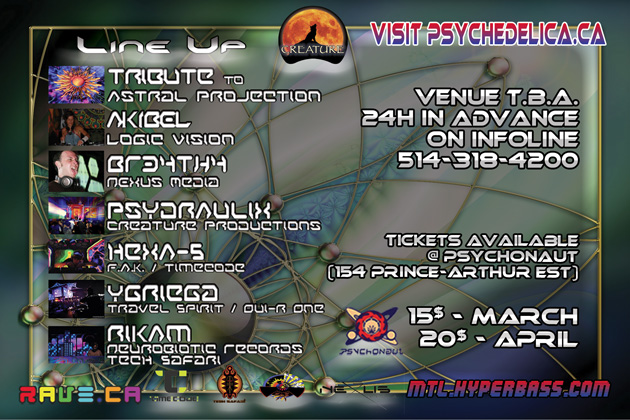
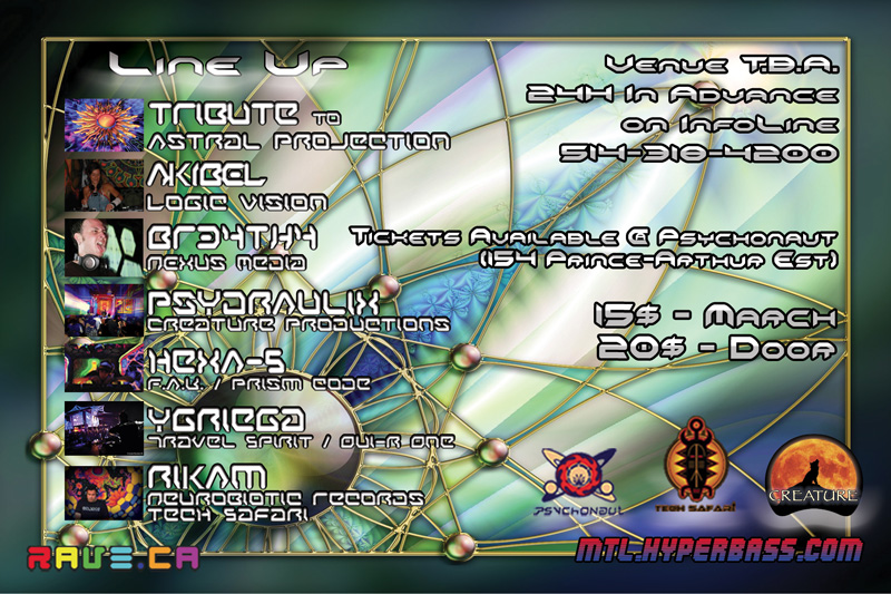
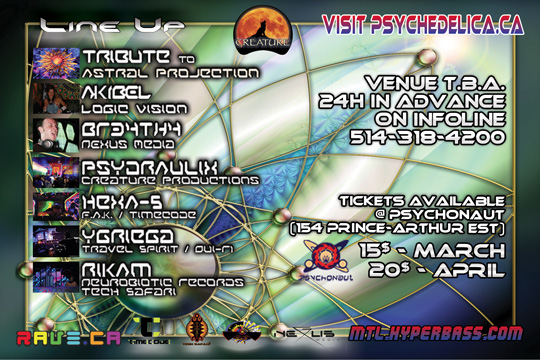
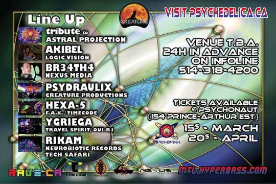
Critisize! (constructively)!
| Good [+1]Toggle ReplyLink» AliceInAcidLand replied on Tue Feb 1, 2011 @ 3:21pm |
| Good [+1]Toggle ReplyLink» FRANKB replied on Tue Feb 1, 2011 @ 4:12pm |
| Good [+2]Toggle ReplyLink» AliceInAcidLand replied on Tue Feb 1, 2011 @ 5:29pm |
| Good [+1]Toggle ReplyLink» Rakoon replied on Wed Feb 2, 2011 @ 11:23am |
Ad a second room, with Ambient/Intelligent/Minimal/Liquid DnB | |
| I'm feeling breeeeee right now.. | |
| Good [+3]Toggle ReplyLink» AYkiN0XiA replied on Wed Feb 2, 2011 @ 3:31pm |
^^ YES :)
and cushions and matresses and bean bags for colective massages and cuddle puddles and chilling sessions. | |
| I'm feeling interested right now.. | |
| Good [+1]Toggle ReplyLink» AlienZeD replied on Wed Feb 2, 2011 @ 3:45pm |
as much as I'd love to have a chillroom, I don't see it happening. Paying an extra 500-800 dollars for a chill room just isn't in the cards... | |
| I'm feeling psyfun right now.. | |
| Good [+1]Toggle ReplyLink» the_pink_popo replied on Wed Feb 2, 2011 @ 4:07pm |
Originally Posted By ALICEINACIDLAND
Fuck pink! More purple! nooooooooooooooo!!!!!! :'( | |
| I'm feeling wow..^_^ right now.. | |
| Good [+1]Toggle ReplyLink» Rakoon replied on Wed Feb 2, 2011 @ 4:57pm |
| Good [+1]Toggle ReplyLink» clown replied on Wed Feb 2, 2011 @ 5:58pm |
definatly alot of psychadelica in this thread !! :P | |
| I'm feeling the other side right now.. | |
| Good [+1]Toggle ReplyLink» MolocH replied on Wed Feb 2, 2011 @ 6:05pm |
Originally Posted By THE_PINK_POPO
nooooooooooooooo!!!!!! :'( Du mauve, c pomal du rose foncé non? :) | |
| I'm feeling blood thirsty right now.. | |
| Good [+1]Toggle ReplyLink» the_pink_popo replied on Wed Feb 2, 2011 @ 6:24pm |
| Good [+1]Toggle ReplyLink» AlienZeD replied on Wed Feb 2, 2011 @ 7:02pm |
[ psydraulix.com ] if anyone wants to fuck around with it...
i don't believe in intellectual property... | |
| I'm feeling psyfun right now.. | |
| Good [+1]Toggle ReplyLink» AliceInAcidLand replied on Fri Feb 18, 2011 @ 2:59am |
| Good [+1]Toggle ReplyLink» prrr replied on Fri Feb 18, 2011 @ 6:36am |
Keep the flower unhidden for sure.
I can do up some drawings for the title like rawali said but then photograph them and put them into photoshop and see what happens. Maybe the title can be entirely original art and not from a font. It's beautiful so far though, what a great combination of colors and imagery. | |
| I'm feeling cuddly right now.. | |
| Good [+1]Toggle ReplyLink» Strik_IX replied on Fri Feb 18, 2011 @ 9:25am |
Too cheap to pay a graphic designer = Typographical Nightmare.
The background is OK but redundent of every other psy flyer in existance. The Typography needs a lot of work, using strokes systematically makes most designs look cheap, all of those choices of fonts also look pretty cheap, no offense. Stretching typography like in the last example should never be seen, it stretches the vectors out of proportion and screws up the edges, plus it looks like its stretched/skewed. Gradients in typography is also a big nono... but seriously, if you want a great flyer and dont have the skills, pay someone... You bitch and complain that DJs should get paid proper, well designing isn't easy, learning the trade doesnt come cheap and it takes years. I'm still paying a 20k student loan and when it comes to contracts i charge 25-40$/hour. Creating a flyer like that is at least 4 hours of work so thats 100$ not just a cheap ass guest list. If a friend with the knowldge volunteers to do it, fine. But coming to us for trade secrets because you're too cheap to pay us is pretty low. You don't wanna pay? Enjoy your crappy flyer and have fun dealing with the printer charging you extra because they have to work an hour on your file to get it to print right. And for the record, graphic design is what I do for a living, it isn't a sideline, it's what pays the bills. It's like that for most of us too. If you don't wanna pay for it, then why should I or any other designer for that matter starve himself? Not like there aren't other contracts out there. | |
| I'm feeling so many robots! right now.. | |
| Good [+1]Toggle ReplyLink» AlienZeD replied on Fri Feb 18, 2011 @ 4:02pm |
I've made a few flyers and they are alright... I'm more of a functionalist than a designer so for me good looks is even slightly less important than legibility and clarity... also I almost as a rule put all my fonts White with black stroke so that black lights make it shine... after all I do most of my promo at psy parties...
can't/won't pay someone this time but I KNOW that if I want an amazing flyer that is what I would need to do. I'm not stupid, just cheap, this time. also, the printer should have no trouble with my 300dpi CMYK 4x6inch image... typo wise, yeah it's not stellar... any ideas? | |
| I'm feeling psyfun right now.. | |
| Good [+1]Toggle ReplyLink» Strik_IX replied on Fri Feb 18, 2011 @ 4:23pm |
Is it bleed? Whats the total ink percentage of your darkest areas? Do your whites contain a bit of color so as to have a full coat of ink? And that's just off the top of my head...
Typo-wise, dont use Matura font, ever. You can easily use dafont if you wish, as long as you dont expect a full set of characters and subsets. I think that systematically adding a stroke looks cheap and you should use a more legible font and use it in reverse or in one solid color (never a gradiant... EVER). Maybe make your background lighter, especially on the reverse so that people can actually read wtf you wrote on there. Seriously though, strokes are ok, I use them all the time on vectors and sometimes on typography, it just shouldn't be rule of thumb. I'd go with a nice sans-sérif, maybe less of a robotic/sci-fi font. Dig on dafont, or DL fontpacks off pirate bay. You arent making a shit ton of money off your partyso you'll never get sued for steeling the full Futura set or any other major font for that matter. Also, you need more space between the names of the DJs and the pics, the pics dont have the same spacing between them which makes it look odd. I personally wouldn't even include the pics as they bring no added value to the flyer at all. Anyway, I'll keep it at that. | |
| I'm feeling so many robots! right now.. | |
| Good [+1]Toggle ReplyLink» AlienZeD replied on Fri Feb 18, 2011 @ 5:08pm |
thanx man I really do appreciate it.
i made this 
before reading your post... so i still got works to do. Update » AlienZeD wrote on Fri Feb 18, 2011 @ 5:09pm yeah I gotta fix that spacing too... and I know photos of the djs are cheap... but it makes it feel more colorful and there will catch those ADDer's :) | |
| I'm feeling psyfun right now.. | |
| Good [+1]Toggle ReplyLink» KounteSs replied on Fri Feb 18, 2011 @ 11:30pm |
i think it looks pretty good for the majority of people though, i mean, most people attending the parties are no graphic designer and basically just want to know what the party is about. we get that it's a psy party, who's gonna be spinning and when it is happening, and it's the main point of your flyer. | |
| I'm feeling ready to rumble right now.. | |
| Good [+1]Toggle ReplyLink» AlienZeD replied on Sat Feb 19, 2011 @ 12:53am |
Critisize! (constructively)!
[ Cumbre de Página ] |
Post A Reply |
You must be logged in to post a reply.
[ Cumbre de Página ] |


