Critisize! (constructively)!
| Good [+1]Toggle ReplyLink» prrr a répondu le Sat 19 Feb, 2011 @ 2:45am |
 Coolness: 43745 Coolness: 43745 | It's fine, I mean, to me it looks good and I'm an artistic type. Maybe I'm biased because I like the specific style. Just something original/different for the title on the front side - underneath the flower and now on top of it - and you're good to go. For me, flyers just have to be eye catching and legible. |
| I'm feeling cuddly right now.. | |
| Good [+1]Toggle ReplyLink» AlienZeD a répondu le Tue 22 Feb, 2011 @ 12:08am |
 Coolness: 509660 Coolness: 509660 | 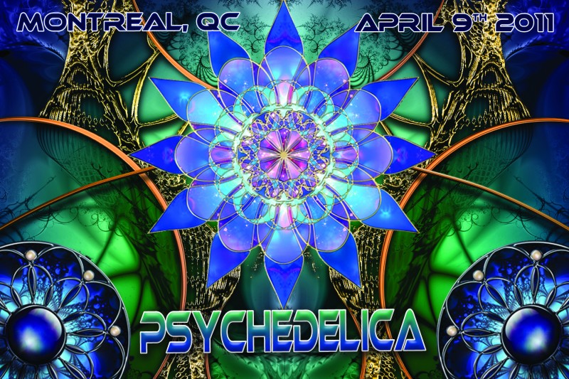
better? |
| I'm feeling psyfun right now.. | |
| Neutral [0]Toggle ReplyLink» JasonBeastly a répondu le Wed 23 Feb, 2011 @ 4:01pm |
 Coolness: 76810 Coolness: 76810 | It's already been done. By like, every psy promoter ever. Is that all that fits into the limited sphere of psychedelia for you? You must be getting some shitty ass acid son. |
| I'm feeling like a bag of dicks right now.. | |
| Good [+2]Toggle ReplyLink» AlienZeD a répondu le Wed 23 Feb, 2011 @ 9:09pm |
| Coolness: 509660 | don't do acid... good to know you feel it's on par with other psy flyers, that is exactly what I was aiming for! |
| I'm feeling psyfun right now.. | |
| Good [+1]Toggle ReplyLink» Kire a répondu le Wed 23 Feb, 2011 @ 9:47pm |
 Coolness: 66800 Coolness: 66800 | sick flyer *thumbs up* |
| I'm feeling psy psy psy! right now.. | |
| Good [+1]Toggle ReplyLink» AYkiN0XiA a répondu le Thu 24 Feb, 2011 @ 5:36pm |
 Coolness: 166675 Coolness: 166675 | i find the font boring, i prefer the first one you used...
but i really enjoy the 'cathedral' feel of it anyways. i look for deco ideas in your flyer architecture :) |
| I'm feeling excited !!! right now.. | |
| Good [+2]Toggle ReplyLink» perception a répondu le Mon 28 Feb, 2011 @ 2:03am |
 Coolness: 66015 Coolness: 66015 | I personally get really annoyed when I have to concentrate to read a simple word, i.e., I like simple fonts, they can have shadows and what not, but let it be legible, the flyer is made to convey information, if I can't get to it, it's pointless. So, I agree with you Mike, functionality should always win... within certain limits (creativity has it's place) :p
I really like the glass looking flower, I like the version that is really bright (since it's a spring party). But, the texture could be increased, and in order to see it more, can you flip it, like put the flower on the right side instead of under all the DJ names...? I dunno, maybe it will look worst, just a thought. I like Psychedelica on the bottom also, but with the other font, the square-ish funky font you had before, it was totally legible. Lastly, I dont like names like "psychedelica strikes back" especially since psy parties rarely have themes, so the names are completely pointless. Psychedelica 5 or wtv number is passible, but may be unnecessary, it will be written in the info that the promotors are bringing you yet another quality event and so on. It's not SOMA 10, it's fucking called SOMA, end of story. Mise À Jour » perception a écrit sur Mon 28 Feb, 2011 @ 2:08am oh, and, wouldn't it be out of place to ask feedback on a flyer in the event section? Wouldn't it lead to people requesting details or people cheering on the event or saying they will attend... I dunno, I'm wondering. Maybe there should be an art section...? |
| I'm feeling punkadelic right now.. | |
| Good [+1]Toggle ReplyLink» rawali a répondu le Mon 28 Feb, 2011 @ 4:41am |
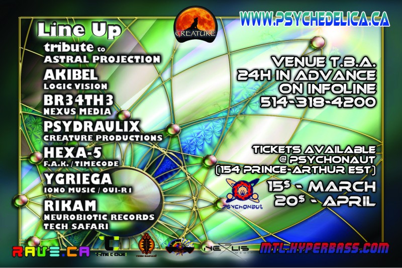
 Coolness: 140785 Coolness: 140785 | ...the flyer is already printed guys |
| I'm feeling forward every thurs right now.. | |
| Good [+1]Toggle ReplyLink» prrr a répondu le Mon 28 Feb, 2011 @ 4:58am |
| Coolness: 43745 | I love it, Mike! Saw it at the party last night and smiled. |
| I'm feeling cuddly right now.. | |
| Good [+2]Toggle ReplyLink» AlienZeD a répondu le Mon 28 Feb, 2011 @ 2:50pm |
| Coolness: 509660 | thank you! for all comments, criticism, etc... you all rock! |
| I'm feeling psyfun right now.. | |
Critisize! (constructively)!
[ Haut de la page ] |
Poster Une Réponse |
Vous devez être connecté pour soumettre une réponse.
[ Haut de la page ] |