Final Flyer Shoot Down!
|
 Coolness: 509595
| 
 What could be improved?
 |
|
| I'm feeling good in the hood right now.. |
|
 Coolness: 66460
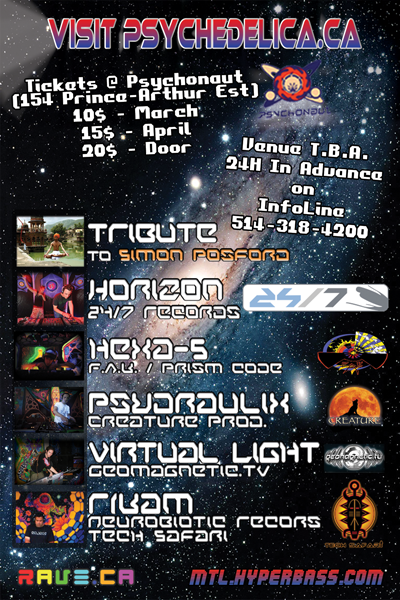
| My only suggestion is font on the names on the back.
For example Hexa-5 to me personally reads as HexD-5.....
That font has a wacky a. |
|
| I'm feeling a monkey right now.. |
|
 Coolness: 140720
| not much... your flyer will look retardedly good under blacklight.. well the front anyways... maybe I'd darken the background on the back a tad just to make things look a lil less busy and your text will pop out a bit more... especially under the blacklights |
|
| I'm feeling lovely right now.. |
|
 Coolness: 685625
| I've got to agree on the font for the DJ names on the back.. looks kinda OK, but a few letters just make it look totally fucked up like the Y, the K and the A, though mostly for Hexa-5, the A looks ok on the rest as weird as that sounds.. I think it's easier to jump to Hexd than hexa 'cause you would hear of someone being Hex'd..
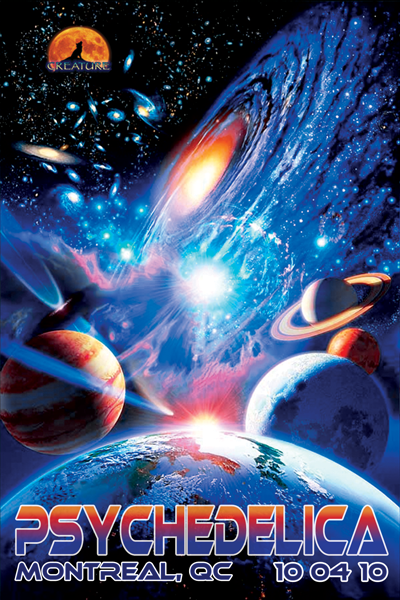
And get rid of the howling wolf logo on the front.. really doesn't fit in imo.. the way you've got it placed looks like it should be a part of the space background, but it's not, and looks really retarded for where it is, especially considering you've also got it on the back; don't repeat stuff unless it's absolutely crucial (like say the label or name of a major out-of-town headliner) |
|
| I'm feeling like a drama magnet right now.. |
|
 Coolness: 166610
| ahhh ok. tribute to posford. i see :) |
|
| I'm feeling break time plz right now.. |
|
Coolness: 66460
| Originally Posted By SCREWHEAD
I've got to agree on the font for the DJ names on the back.. looks kinda OK, but a few letters just make it look totally fucked up like the Y, the K and the A, though mostly for Hexa-5, the A looks ok on the rest as weird as that sounds.. I think it's easier to jump to Hexd than hexa 'cause you would hear of someone being Hex'd..
And get rid of the howling wolf logo on the front.. really doesn't fit in imo.. the way you've got it placed looks like it should be a part of the space background, but it's not, and looks really retarded for where it is, especially considering you've also got it on the back; don't repeat stuff unless it's absolutely crucial (like say the label or name of a major out-of-town headliner)
From watching my old roomie in Florida design flyers for a living, a lot of what you said is true. And his general rule of thumb, logos go on the back. Logos on the front distract from the venus/show concept/main thing your trying to get across. |
|
| I'm feeling a monkey right now.. |
|
 Coolness: 76290
| i was going to say, if anything, if you have to have the creature wolf logo ... try and make it more subtle, like inseting just the wolf shilouet onto one one of the planets, or just making the logo smaller all together
and horse like |
|
| I'm feeling parrain right now.. |
|
Coolness: 66460
| Def needs more horse... |
|
| I'm feeling a monkey right now.. |
|
 Coolness: 103370
| You're also missing DJ Br34th3 on the flyer. |
|
| I'm feeling jazz right now.. |
|
Coolness: 509595
| Originally Posted By NEUROMYTH
You're also missing DJ Br34th3 on the flyer.
very true, DJ Br34th3 is definitely missing. but methinks he'll continue to be a big part of our scene given how awesome he is.
will see what I can do about that 'a' and I guess I'll take the logo off of the front.
thanks!! |
|
| I'm feeling good in the hood right now.. |
|
 Coolness: 299360
| i'd scrap the whole thing and put a giant tit on it. Let the people guess the line-up. It's not like anyone used flyers anymore anyways |
|
| I'm feeling the president right now.. |
|
Coolness: 685625
| Originally Posted By EL_PRESIDENTE
i'd scrap the whole thing and put a giant tit on it. Let the people guess the line-up. It's not like anyone used flyers anymore anyways
seriously.. these days handing a flyer out to someone is like saying "Hey man, can you throw this out for me?"
Everyone is on the forums, everyone gets invited to the party 12 times a week on Facebook.. Flyering at a rave is totally counter-productive and a waste of your resources.. go flyer out in the street and bring new people into the scene! |
|
| I'm feeling like a drama magnet right now.. |
|
Coolness: 509595
| Originally Posted By SCREWHEAD
go flyer out in the street and bring new people into the scene!
i do :) |
|
| I'm feeling good in the hood right now.. |
|
Coolness: 299360
| TITS! |
|
| I'm feeling the president right now.. |
|
Coolness: 509595
| you make good point i must admit |
|
| I'm feeling good in the hood right now.. |
|
 Coolness: 220005
| im not a huge fan of the fonts on the back, but the front looks solid, wolf or not, nice colors. |
|
| I'm feeling like a sketchbook! right now.. |
|
 Coolness: 134305
| |
|
| I'm feeling merkle right now.. |
|
Coolness: 509595
| |
|
| I'm feeling good in the hood right now.. |
|
Coolness: 66460
| Font is mucho better. |
|
| I'm feeling a monkey right now.. |
|
 Coolness: 106150
| Does the "Creature" logo really have to be in the main picture? |
|
| I'm feeling inner voices right now.. |
Final Flyer Shoot Down!
You must be logged in to post a reply.

