In The Spirit Of Rave.ca
| Good [+1]Toggle ReplyLink» Screwhead replied on Mon Mar 23, 2009 @ 2:47am |
 Coolness: 685585 Coolness: 685585 | ok joking aside, the only real "problem" is you've got too many different fonts on there, and some of them (especially the fonts in the middle with the venue/tickets/infoline/etc..) is just so "Windows standard font" that it brings down the rest of the flyer..
I mean there's like seven different fonts on there.. The only things that should have different fonts than the party info is the name of the party, and any logos/associations/whatever that use specific fonts because the name is also the logo (or part of it) To use a flyer I just did for the Ed Rush party that was this weekend as an example: 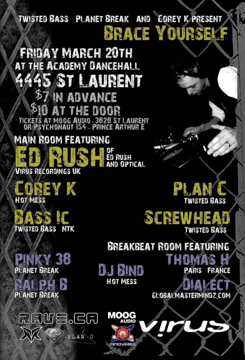
That's all one font, with logos at the bottom.. You don't need different fonts to make different things/areas seperate, just a little imagination.. Too many different fonts is like using CG in movies; it's good if it's subtle, but if it's not subtle then it's just cheezy and gaudy and comes off like the actual design of the flyer is an after-thought to you showing off the AWESOME NEW FONTS you just got. |
| I'm feeling your norks right now.. | |
| Good [+1]Toggle ReplyLink» AlienZeD replied on Mon Mar 23, 2009 @ 2:54am |
 Coolness: 509555 Coolness: 509555 | all great tips! you guys rock |
| I'm feeling will dj for money right now.. | |
| Good [+1]Toggle ReplyLink» rawali replied on Mon Mar 23, 2009 @ 2:58am |
 Coolness: 140680 Coolness: 140680 | no black borders... ever... EVER!!!!!!
they make your flyer look trapped in a box... speaking of boxes, keep them to a minimum... i know your background pic makes shit hard to read if you just slap it on there but using boxes all over the damn place is a poor solution... either find a background pic that has little enough variation so that the text remain legible OR mess with the pic you want... might i suggest giving it a colorizing with a single color and making it very low contrast |
| I'm feeling lovely right now.. | |
| Good [+1]Toggle ReplyLink» AlienZeD replied on Mon Mar 23, 2009 @ 3:03am |
| Coolness: 509555 | a colorizing? what's that? :D
latest...  |
| I'm feeling will dj for money right now.. | |
| Good [+1]Toggle ReplyLink» rawali replied on Mon Mar 23, 2009 @ 3:07am |
| Coolness: 140680 | layer/new adjustment layer/hue saturation
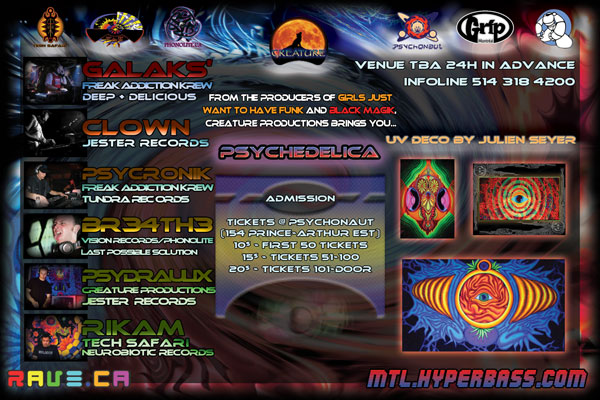
in that dialogue box there is a lil button called colorize... also, if you are gonna use a three column layout like that, make sure your columns are equal and that the space between the columns is constant... then try playing around with the text... having some elements being two columns wide for example... btw... its galaks' or galaksy... not galaksi |
| I'm feeling lovely right now.. | |
| Good [+1]Toggle ReplyLink» DynV replied on Mon Mar 23, 2009 @ 4:18am |
 Coolness: 108800 Coolness: 108800 | Originally Posted By ALIENZED

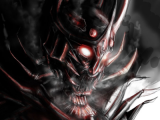
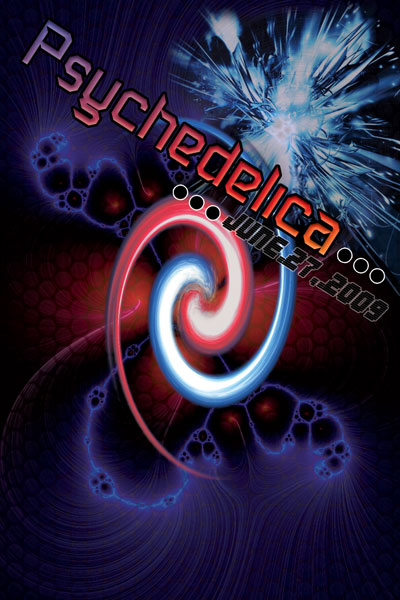
I like that one. There's already psychedelia at the right so no need to fill it all, I think it's overkill although I'd drop the bottom 2 thumbnails. A problem with that is that will the party scene be visible on the small flyer, might have to zoom in a bit. |
| I'm feeling lucky that my countr right now.. | |
| Good [+1]Toggle ReplyLink» Screwhead replied on Mon Mar 23, 2009 @ 6:03am |
| Coolness: 685585 | It's way too cluttered.. I didn't even notice the bottom thumbs untill DynV pointed them out..
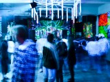
I think people that are going to give the flyer a look are going to know what kind of party it is, no need for pictures of a crowd of ravers.. You're not throwing a 15000 attending festival, and the thumbnails are covering up the "psychadelic art" which should be your main focus, as it's a psy party. And seriously, do something about the fonts.. If not all of them, change the middle one for all the party info to something other than Comic; it makes the flyer look like my grandmother could have done it in Paint with a default windows install and really makes things look like you put zero effort into it. |
| I'm feeling your norks right now.. | |
| Good [+1]Toggle ReplyLink» nothingnopenope replied on Mon Mar 23, 2009 @ 8:58am |
 Coolness: 201220 Coolness: 201220 | Verdana is a good alternative to Comic Sans. Never use Comic sans.
Or go to a free font site and get an 'Anime' or 'Manga' style font for the comic look, they are sleeker. Fred is right about the fonts, it's a good idea to never use more than two (and DIFFERENT) types of fonts on one page. 3 max. Although I'll point out that on Fred's flyer, I would have used a different, clearer font for the white text, and used the grungy looking one for only the yellow names :) And i would have kept the [ RAVE.CA ] with its normal colour, you shouldn't mess with people's logos.. But it is a great example of how to do proper text LAYOUT. That is dead on. |
| I'm feeling meow right now.. | |
| Good [+1]Toggle ReplyLink» Screwhead replied on Mon Mar 23, 2009 @ 9:34am |
| Coolness: 685585 | Originally Posted By SCOTTYP
And i would have kept the [ RAVE.CA ] with its normal colour, you shouldn't mess with people's logos.. [ www.rave.ca ] ;) |
| I'm feeling your norks right now.. | |
| Good [+1]Toggle ReplyLink» nothingnopenope replied on Mon Mar 23, 2009 @ 12:03pm |
| Coolness: 201220 | It's weird that the new one isn't there... the one in the top right hand side of the screen |
| I'm feeling meow right now.. | |
| Good [+1]Toggle ReplyLink» E73V3N replied on Mon Mar 23, 2009 @ 12:30pm |
 Coolness: 46990 Coolness: 46990 | Originally Posted By ALIENZED
damn, that's frickin nice! :O can I... can I use that? Sure, drop me a mp with your e-mail adress and i will send you a printable version. Originally Posted By ALIENZED
how did you make that fence like octagon grid? I used this pattern: [ s0nkite.deviantart.com ] Here is how to use and install patern in photoshop: [ www.obsidiandawn.com ] Here a few comments for the back. Some other user have already commented, and i may repeat there tips: -There are too much different fonts on the back, use 2 maximum, if u want to add some variation, make your font bold or thinner, depending on where u want to draw attention. Here are a few free fonts that would fit a psy flyer: [ paulw.deviantart.com ] [ atobgraphics.deviantart.com ] [ dream-forge.deviantart.com ] - I would also change the layout of the back. Those 3 sections are a bit too generic. Get crazy with your placement, as long as it seems good for the eye and the infos are there, your good to go. -Make the photo of the djs square with rounded corner and outline them. -Blur the background until everything is easy to read -Make yourself a color pallet and stick to it, try to have not more than 3 mains colors for your fonts and background. -If u have a dark background, outline your fonts with a fine white line, it will make em more readable. -Do not forget to work with 300dpi resolution, otherwise, the printed version will be blurry. Here a few flyers i did during the last 4 years, if u need anymore inspiration: 


 Update » E73V3N wrote on Mon Mar 23, 2009 @ 12:36pm Sorry grammar nazis... i rarely write in english... must be horrible to read ! |
| I'm feeling renard right now.. | |
| Good [+1]Toggle ReplyLink» AlienZeD replied on Mon Mar 23, 2009 @ 3:12pm |
| Coolness: 509555 | How much of a bleed to I need?
Like, part of the image is cut off right? Why is that anyway? You figure they could get their shit together and NOT cut off part of the image you give them... Update » AlienZeD wrote on Mon Mar 23, 2009 @ 4:04pm three new revisions! blast more! are the fonts ok now?

 Update » AlienZeD wrote on Mon Mar 23, 2009 @ 4:15pm my orinigal looks so damn cheap now, like some kind of bad cartoon |
| I'm feeling will dj for money right now.. | |

| Good [+1]Toggle ReplyLink» Mico replied on Mon Mar 23, 2009 @ 5:32pm |
 Coolness: 150455 Coolness: 150455 | Originally Posted By EL_LEADER_MAXIMO
the middle looks like a goatse once you see, you cannot unsee. |
| I'm feeling cool right now.. | |
| Good [+1]Toggle ReplyLink» Nathan replied on Mon Mar 23, 2009 @ 5:36pm |
 Coolness: 166540 Coolness: 166540 | Originally Posted By MICO
once you see, you cannot unsee. haha! so true for many things in life... |
| I'm feeling you up right now.. | |
| Good [+1]Toggle ReplyLink» AlienZeD replied on Mon Mar 23, 2009 @ 5:49pm |
| Coolness: 509555 | do you guys prefer the vertical one with the slanted text or the straight text at the bottom (front of course, about two posts up) |
| I'm feeling will dj for money right now.. | |
| Good [+1]Toggle ReplyLink» system_glitch replied on Mon Mar 23, 2009 @ 5:51pm |
 Coolness: 162495 Coolness: 162495 | I prefer the one with the text at the bottom. |
| I'm feeling laundering karma right now.. | |
| Good [+1]Toggle ReplyLink» AlienZeD replied on Mon Mar 23, 2009 @ 5:52pm |
| Coolness: 509555 | that makes 2 vs 0! thx eh |
| I'm feeling will dj for money right now.. | |
| Good [+1]Toggle ReplyLink» Sparklz replied on Mon Mar 23, 2009 @ 5:52pm |
 Coolness: 113390 Coolness: 113390 | Originally Posted By STRANGEDAHLIA
I prefer the one with the text at the bottom. me too |
| I'm feeling a little teapot right now.. | |
| Good [+1]Toggle ReplyLink» Nathan replied on Mon Mar 23, 2009 @ 5:55pm |
| Coolness: 166540 | Originally Posted By SPARKLZ
me too ditto |
| I'm feeling you up right now.. | |
| Good [+1]Toggle ReplyLink» Kishmay_Pinas replied on Mon Mar 23, 2009 @ 6:03pm |
 Coolness: 103250 Coolness: 103250 | HOnestly, on the back of the flyer, remove the name of the party all together.
I like how the front is simple with jsut the name and date. NO need to repeat the name of the party again on the back imo Front should flash, back side should have all the info clearly established, and not too cluttered And I would suggest having all of your logos together either on the top or the bottom, not separated as they are now. |
| I'm feeling jungle jam in june! right now.. | |
In The Spirit Of Rave.ca
[ Top Of Page ] |
Post A Reply |
You must be logged in to post a reply.
[ Top Of Page ] |