In The Spirit Of Rave.ca
| Good [+1]Toggle ReplyLink» AlienZeD a répondu le Sun 22 Mar, 2009 @ 8:21pm |
 Coolness: 509515 Coolness: 509515 | Blast this flyer! (hopefully constructively)
 |
| I'm feeling will dj for money right now.. | |
| Good [+1]Toggle ReplyLink» El_Presidente a répondu le Sun 22 Mar, 2009 @ 8:51pm |
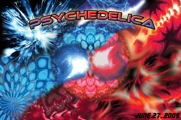
 Coolness: 299280 Coolness: 299280 | the middle looks like a goatse |
| I'm feeling tipsy for prez 2009 right now.. | |
| Good [+1]Toggle ReplyLink» v.2-1 a répondu le Sun 22 Mar, 2009 @ 8:58pm |
 Coolness: 159075 Coolness: 159075 | The font used doesn't scream psy either. More of a font I'd use for a techno or D&B flyer.
And I'm not feeling the middle "swirls" either. :-/ |
| I'm feeling like nico bellic right now.. | |
| Good [+1]Toggle ReplyLink» Screwhead a répondu le Sun 22 Mar, 2009 @ 9:22pm |
 Coolness: 685545 Coolness: 685545 | Originally Posted By EL_LEADER_MAXIMO
the middle looks like a goatse QFT |
| I'm feeling your norks right now.. | |
| Good [+1]Toggle ReplyLink» AlienZeD a répondu le Sun 22 Mar, 2009 @ 10:40pm |
| Coolness: 509515 | what does qft mean? |
| I'm feeling will dj for money right now.. | |
| Good [+1]Toggle ReplyLink» MolocH a répondu le Sun 22 Mar, 2009 @ 10:41pm |
 Coolness: 226230 Coolness: 226230 | Originally Posted By ALIENZED
what does qft mean? Quite a FacT. |
| I'm feeling ballistic right now.. | |
| Good [+1]Toggle ReplyLink» DCRn a répondu le Sun 22 Mar, 2009 @ 10:41pm |
 Coolness: 158190 Coolness: 158190 | Quoted for Truth. |
| I'm feeling repomanish right now.. | |
| Good [+1]Toggle ReplyLink» MolocH a répondu le Sun 22 Mar, 2009 @ 10:41pm |
| Coolness: 226230 | Originally Posted By DRNYARLATHOTEP
Quoted for Truth. Fair enough:) |
| I'm feeling ballistic right now.. | |
| Good [+1]Toggle ReplyLink» karma.millie a répondu le Sun 22 Mar, 2009 @ 10:53pm |
 Coolness: 38240 Coolness: 38240 | Originally Posted By SCREWHEAD
QFT Quit fucking talking no? |
| I'm feeling wanna hug yo face! right now.. | |
| Good [+1]Toggle ReplyLink» neoform a répondu le Sun 22 Mar, 2009 @ 11:13pm |
 Coolness: 339620 Coolness: 339620 | Originally Posted By KARMA.MILLIE
Quit fucking talking no? .. no. |
| I'm feeling almighty right now.. | |
| Good [+1]Toggle ReplyLink» Rammius a répondu le Sun 22 Mar, 2009 @ 11:15pm |
 Coolness: 32250 Coolness: 32250 | Make the swirls more pronounced, and use a gentler, trippier font. Add a few more swirls maybe or curve the sparks on the top left side. |
| I'm feeling is mildly perturbed right now.. | |
| Good [+1]Toggle ReplyLink» DCRn a répondu le Mon 23 Mar, 2009 @ 12:31am |
| Coolness: 158190 | "Quoted For Truth" - "qft" is a label used on Internet forums when someone quotes a debated statement, thereby ensuring that the original statement can not be edited or deleted by the person being quoted. Later also used as a sign of agreement with another poster.
Everything else is wrong :) |
| I'm feeling repomanish right now.. | |
| Good [+1]Toggle ReplyLink» Kishmay_Pinas a répondu le Mon 23 Mar, 2009 @ 12:32am |
 Coolness: 103210 Coolness: 103210 | and what Dr N said is quite fucking true!
For a flyer, well er uhm let me state the obvious and say there is a whole shit load of info missing from it ;) |
| I'm feeling jungle jam in june! right now.. | |
| Good [+1]Toggle ReplyLink» E73V3N a répondu le Mon 23 Mar, 2009 @ 12:50am |
 Coolness: 46950 Coolness: 46950 | Here are a few suggestions:
-Keep your format the same but make it a vertical one. -U should leave some empty spots, there is too much going on at the same time on this flyer. -Change your font -make the gradient inside the font horizontal instead of vertical. -Get your date more inside, it might be cut when printed -add. some dots, or any graphic element around your font to draw attention there. -dont bend your font like a rainbow, reminds me of power point. -de-center your flyer to give a more dynamic feel. I could do a quick 5 minute rough sketch to show u what i would do if u are interested. Hope that was constructive ! Mise À Jour » E73V3N a écrit sur Mon 23 Mar, 2009 @ 1:02am Here is a 5 in rough with the all the elements i sugested above.
Hope that will help  |
| I'm feeling renard right now.. | |
| Good [+1]Toggle ReplyLink» DynV a répondu le Mon 23 Mar, 2009 @ 1:43am |
 Coolness: 108760 Coolness: 108760 | Originally Posted By E73V3N
I could do a quick 5 minute rough sketch to show u what i would do if u are interested. Wow that's real brute talent ! Kudos. |
| I'm feeling lucky that my countr right now.. | |
| Good [+1]Toggle ReplyLink» nothingnopenope a répondu le Mon 23 Mar, 2009 @ 1:46am |
 Coolness: 201180 Coolness: 201180 | I'd try different fonts and I like the idea of the circles and the layout of the words in the sketch.. everything else seems par for course for a psy flyer. |
| I'm feeling meow right now.. | |
| Good [+1]Toggle ReplyLink» Gamos a répondu le Mon 23 Mar, 2009 @ 2:14am |
 Coolness: 93450 Coolness: 93450 | Originally Posted By KARMA.MILLIE
Quit fucking talking no? Its frangalis for "Quoi fuck the" |
| I'm feeling apathetic right now.. | |
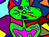
| Good [+1]Toggle ReplyLink» AlienZeD a répondu le Mon 23 Mar, 2009 @ 2:19am |
| Coolness: 509515 | damn, that's frickin nice! :O can I... can I use that? it would make some sick posters. I'll give you one :D
how did you make that fence like octagon grid? I was gonna show y'all some potential back of the flyer shots but now I'm all shy! here goes nothing (really, nothing compared to what a real graphic artist can do) 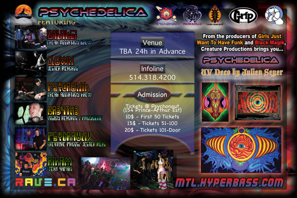
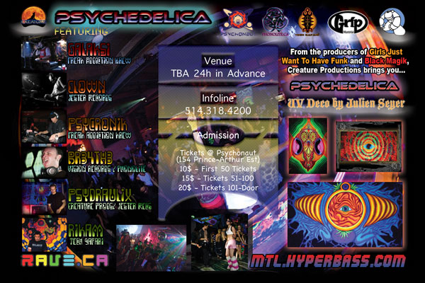
basically those are different potential backgrounds, but I'd love for y'all to totally rip it apart and shame my graphic lack of talent. now that I look at it, the dj name aren't readable enough |
| I'm feeling will dj for money right now.. | |
| Good [+1]Toggle ReplyLink» Screwhead a répondu le Mon 23 Mar, 2009 @ 2:30am |
| Coolness: 685545 |  |
| I'm feeling your norks right now.. | |
| Good [+1]Toggle ReplyLink» Nathan a répondu le Mon 23 Mar, 2009 @ 2:38am |
 Coolness: 166500 Coolness: 166500 | i like the 1st one best...it's a fine flyer. don't stress yourself out too much with perfecting a flyer, as long as he info is there & legible, and it's pretty :) The front is more important as far as 'looks' are concerned...
for the DJ names, the font is cool, but yeah, you might want to make the letters a little bigger & brighter, and put some space between the letters. it's a little crowded w/ various pictures too, but i'm just a minimalist :p wicked line-up, btw! no need to rip the flyer apart, unless it's to make a filter for a joint - lol |
| I'm feeling you up right now.. | |
In The Spirit Of Rave.ca
[ Haut de la page ] |
Poster Une Réponse |
Vous devez être connecté pour soumettre une réponse.
[ Haut de la page ] |